Maybe you’re genuinely interested in the logo design process, maybe you’re considering hiring a professional designer (expensive) or using one of those free logo makers online (cliché)… Regardless, the goal is to create a church logo that is beautiful, effective and long-standing. The colors and fonts need to feel congruent with the church’s culture, and you get extra points if the Elder board doesn’t hate it.
Having worked with (and at!) churches for the past 15 years, we understand how important a good logo is. We’ve had the honor of walking with dozens of ministries through rebrand processes, and we’ve seen some beautiful, longstanding brands emerge. Logos are the face with the place. Logos evoke emotions in us. Logos are marks that are tethered to past experiences we’ve had. They’re incredibly powerful tools for building community and developing a common language.
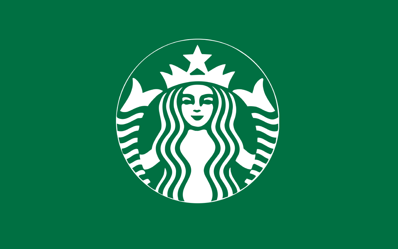
To prove the power of a simple mark evoking emotion: How do these logos make you feel?

1.The more detailed a logo is the shorter its’ lifespan.
How many of us have seen a logo with five different things going on? There’s an open book with a drop of blood coming out of it, with a dove catching the drop on an olive branch, and the branch turns into a Cross, with three nails on it, twisted into an ichthus… If your logo has gradients, fine line details, more than 3 colors, or more than 2 typefaces, you’ll likely be RE-designing your logo next year. Go simple. Choose a dependable typeface (one that’s been around for more than a few years!).
2. Logos should be distinctive, not descriptive.
Another mistake people make is feeling the need to have logos describe their entire organization. “Well, because we’re a global ministry, that also focuses on serving the homeless and helping them get their GEDs, let’s have the logo be a globe with a homeless guy holding a diploma?” We laugh, but you know how those committee-conversations go. Choose an icon or an element that is distinctive. What will allow your church to stand out from other local ministries? What combination of icon and color and typeface will help people remember you? Logos should be distinctive, not descriptive.
3. Versatility is king
If your new logo can’t be stripped of its’ color and texture and stand on its’ own, you’re not done yet. Logos need to be versatile. They need to work as a one-color screen printed shirt. They need to work as white on black (and black on white), as well as applied in any relevant color combination. Will it work in bright pink? Maybe not. That’s ok. But does it work in every earth-tone? Does it work in the complementary colors of your primary color? There’s nothing more frustrating a few months down the road from a rebrand than realizing how limiting the new logo is. Test your logo in a wide variety of environments before signing on the dotted line.
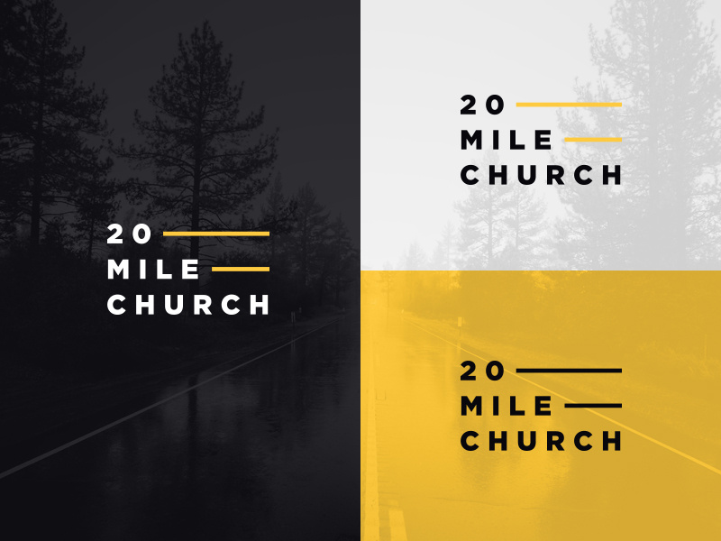
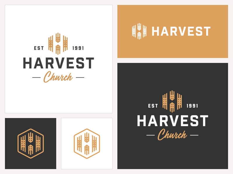
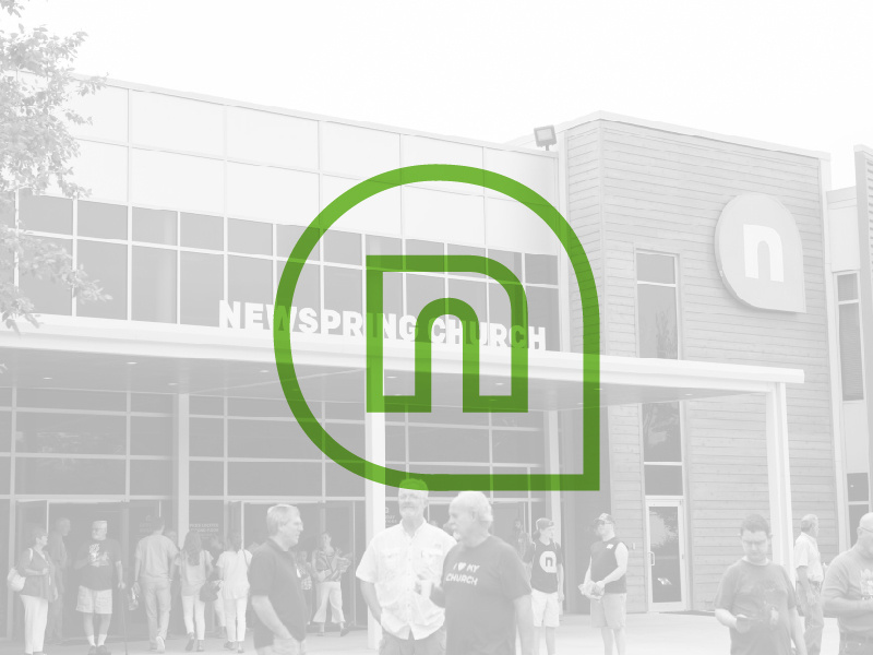
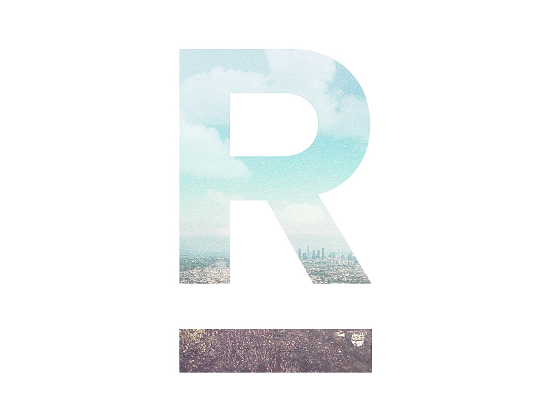
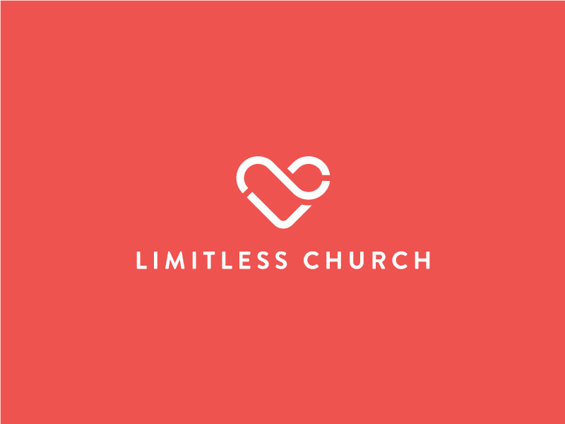
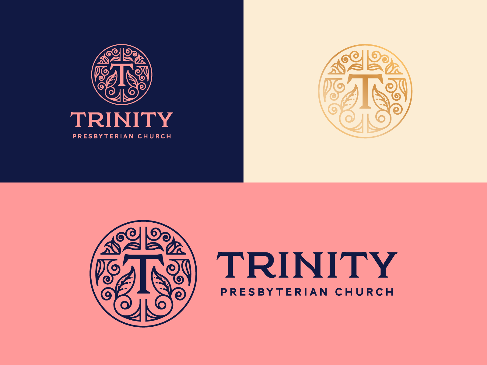
Here are some beautiful examples of visual identities for church logos:


Questions about designing your church logo?
We’ve rebranded dozens of churches. We’d love to answer any of your questions (or just help feedback on some ideas you have!) Schedule a free call with someone on our team.


